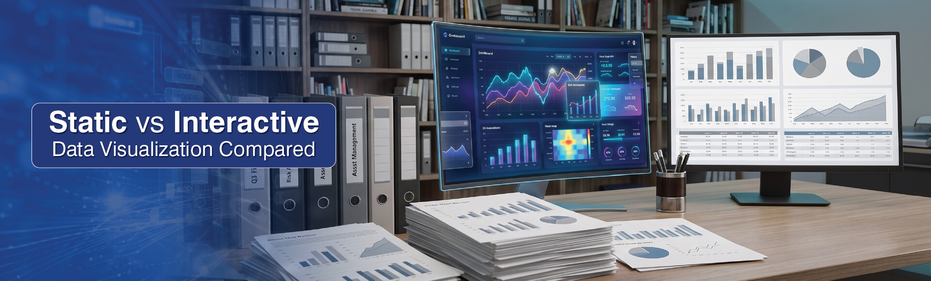
You face the choice of using static vs interactive visualizations whenever you need to report on operations, status or any other field. But knowing which to choose when for effectiveness depends on key seven differences between these two types of data visualizations.
Table of Contents
The meetings that happen over static vs interactive data visualization in analytics rooms is actually a debate over data architecture and visualization.
Both data visualization types are used widely. A static visualization is usually carried in a PDF or PNG file and represents a single point-in-time rendering of data points. Such static data visualization examples would include what we use everyday like bars, charts or histograms.
The core difference between these two kinds of visualization, for the user, is whether he or she will have to go back to the analyst for a follow-up question, or can get the answer to the next question from the visualization itself.
The 7 Key Differences That Lie Between Static and Interactive Data Visualizations
Considering static vs interactive data visualization is not an either/or consideration. Both types are used regularly in the world of business. But knowing where to use which helps analysts let the data do useful storytelling. The following data visualization comparison outlines the seven differences that will help you be sure of when to use interactive dashboards and when static.
Drowning in scattered data?
Build an interactive dashboardDifference 1. From Point-in-Time Snapshots to a Live Query Layer
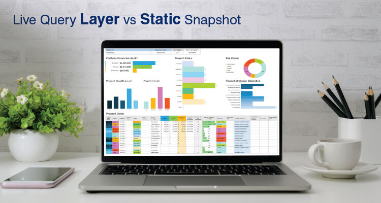
Static exports represent a batch snapshot. Once created the snapshot and its underlying data sources do not share state. Interactive views maintain an open connection with the data source, so each time the user interacts with the view, the output is generated from the current version of the data. It’s a live query layer.
DirectQuery in Power BI generates a new query against all tables in the model for each interaction with an object. In Tableau, Extract Mode creates a materialized view for faster rendering.
The difference in terms of using static charts vs interactive dashboards is particularly evident when working with operational data; i.e., a manufacturing line status board or a real estate listing feed that was frozen at the time of export can be incorrect by the time it is viewed.
Difference 2. From Stale Snapshots to Real-Time Data Visualization
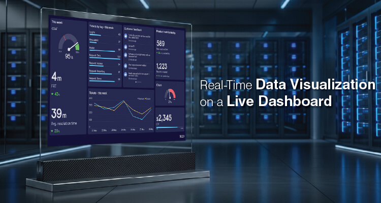
A static report won’t be able to display a change that occurred since it was exported. It would need a completely new regeneration cycle, and that delay, when on a factory floor, can become costly.
A static chart cannot issue any real-time alerts, so any equipment failure won’t be visible until loss of product or quality is detected on the shop floor.
A business intelligence dashboard with dynamic views provide a constant interaction loop driven by updates and real-time data visualization. The link is usually established via WebSocket or server-sent events, and the rendered view changes with the arrival of each new record.
Power BI streaming datasets and Tableau live connections are used to implement these interactive setups, while Apache Kafka and Azure Event Hubs are used for setting the frequency of reporting.
When monitoring manufacturing floors in real time, this helps close the gap between when a fault is caught and when it gets reported.
Difference 3. From Fixed Aggregation to Drill-Down for Root Cause
A static dataset represents a single aggregation level as determined by the designer when the static was created. It is able to show that the scrap rate went up or that a region did not meet their target. But it won’t be able to answer why.
An interactive view provides users with the ability to drill down through a dimension hierarchy (a very common type of interaction known as OLAP cube navigation) as they navigate from Plant -> Line -> Shift, or Region -> Building -> Unit, each drill-down action generating a new query.
This user-driven data exploration is what helps turn the situation from “there is an issue” into “it is this machine during this shift that caused it.”
Interactive root cause analysis using Power BI drill-through, Tableau hierarchies, and Qlik’s associative model allows a user to probe the data to a depth that a static report can never hope to reach.
Difference 4. From Independent Charts to In-Memory Dashboard Performance and Scalability
In manufacturing and real estate, an enormous amount of data is collected: every single machine, every single property, every single transaction. When you render that onto a static screen, that is called “clutter,” and when your screen has too much data to render as a static image, it can’t be rendered.
An interactive view or visualization does everything with a shared in-memory model, so each time you filter one chart or table, every other chart or table gets filtered too.
This is where both Power BI’s VertiPaq engine and Tableau’s in-memory columnar store make their dashboard performance and scalability play: these engines use columnar compression and query pruning to keep even a very large model interactive.
When you produce a static export of your model, there is no engine to enable interactive analysis and you will never be able to interactively analyze a volume of data like the kind used for manufacturing analytics reporting. Because the high data aggregation outgrows static formats fast.
Difference 5. From One View for All to Row-Level Security
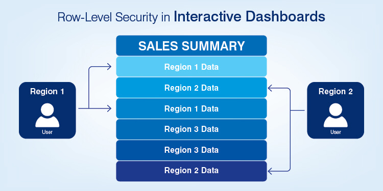
When you distribute a static file, you are going to deliver the exact same content to every person who receives it. If you have twenty regional managers who need region-specific reports, then you are going to have to do twenty separate exports, or you run the risk of exposing data others were not meant to have.
If you create an interactive dashboard, you can apply row level security by filtering the underlying dataset at query execution based on the user’s current identity. With row-level security implemented through authentication, each time a user logs into the system, they will see only those rows within the same URL that they are allowed to see based upon their identity. This means you don’t have to patch your interface, but instead enforce the access rights at the model itself.
DAX-based RLS rules in Power BI and user attribute filters within Looker are two ways to implement row level security. Using row level security makes it possible for a single real estate portfolio dashboard to support multiple teams of regional managers working on different sets of properties and why its used in real estate analytics reporting.
Difference 6. From Read-Only Artifacts to Collaborative Data Storytelling
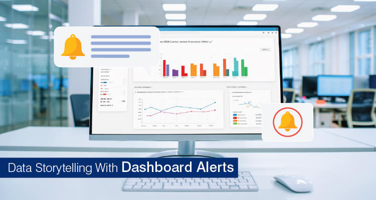
Static reports are read-only files that run on a schedule and therefore all findings are flagged outside the chart.
Interactive data analytics reporting platforms such as Power BI allow analysts to add elements such as in-dashboard annotation layers, comments, and set thresholds that send notifications when a metric crosses its boundaries.
Power BI Smart Narrative automatically creates a plain-language summary and annotations that allow analysts to narrate the cause within the same platform. So, analysts use these data storytelling techniques to explain the “why” behind the numbers.
The threshold notification also sends the same dashboard to the appropriate personnel (i.e., Plant/Asset Manager) via email, Slack or Teams.
Strong UX in data visualization contains and displays the alert, the annotation, and the chart in a unified surface, so the dashboard can act as a workflow trigger, and not remain a passive display.
Difference 7. From Manual Versioning to Governed Data Analytics Reporting
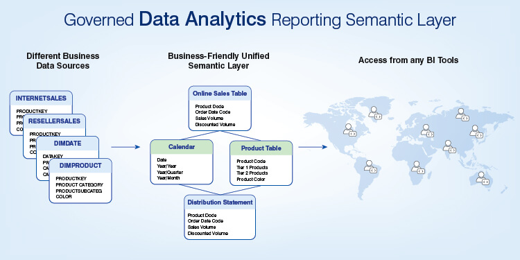
A static chart does not reside inside the governed layer and therefore has no lineage to its data source, no certified Key Performance Indicator (KPI) and no access log. But all interactive data analytics reporting is built using a governed semantic layer and references a single certified definition for each metric.
This provides value to companies where there is a need to have a single definition for a specific term across multiple locations: One definition of Overall Equipment Effectiveness (OEE) per site or one definition of occupancy across a portfolio of properties.
Semantic Layers are implemented through Power BI datasets, Looker LookML and dbt metrics Layer. Usage telemetry is collected natively within each product to support tracking activity in the audit trail.
Defining each metric once is a fundamental discipline of data visualization best practices, and this is what stops conflicting dashboards from proliferating.
Real estate data siloed?
Get a portfolio dashboardQuick-Reference Comparison: Static vs Interactive Data Visualization
| Dimension | Static Visualization | Interactive Visualization |
|---|---|---|
| Data Rendering | Point-in-time snapshot | Live query layer (DirectQuery / API) |
| Real-Time | No alerts; full regeneration | WebSocket / streaming, live alerts |
| Drill-Down | Fixed aggregation, no root cause | Traversable hierarchies to root cause |
| Performance | Clutters on heavy data | In-memory model, scales responsively |
| Personalization | Same view for all | RLS-scoped per user / portfolio |
| Collaboration | Read-only | Annotations, alerts, storytelling |
| Governance | No lineage | Certified semantic layer + audit |
When to Use Interactive Dashboards, and When Static Wins
Choosing when to use interactive dashboards is a fit decision, and it follows data visualization best practices tied to the decision at hand.
Interactive dashboards are better suited for applications that require real-time floor monitoring, root cause analysis, role-based portfolio views, and any application requiring user-driven data exploration.
Static visualizations are better suited for applications such as:
- Shift handoffs
- Daily Executive Summaries
- Board Packs
- Printed/Archived Reports
In these applications, an easily viewed snapshot of high level KPI’s such as OEE or Occupancy will be easier to interpret than a filtered view of multiple KPI’s on a single screen.
If you provide too many options for filtering/drill down, non-technical floor/field personnel may become overwhelmed by the number of choices available to them. So, the simplest fit is often the best.
The most common visualization pattern found across industries is hybrid visualization. In these cases, interactive dashboards are used to plumb a governed source of truth, while static exports are meant for external stakeholders. For teams weighing the trade-off, decision support analytics will help you ensure that data-driven decision making utilizes the right information layer.
Conclusion
Static vs interactive data visualization is not simply about a tool preference because it comes down to how well the visualization type represents the “production line” or “property portfolio” that it’s reporting about.
A static export becomes frozen in time when it is exported, therefore as volume and velocity increase, the report quickly drifts away from real time events, and is already stale by the time a fault occurs.
Teams that use one common governance layer underneath both modes are those that lead. Because a metric such as OEE (Overall Equipment Effectiveness) or Occupancy reads the same for them from floor-to-boardroom.
Published by HitechAnalytics. HitechAnalytics delivers data engineering, analytics, business intelligence, and visualization services across manufacturing, real estate, and other B2B sectors.
FAQ
A static visualization is a “snapshot in time” or a “one-off snapshot” (PDF, PNG, or SVG), created at a specific point in time, with no live data feed or way to get input from the end-user.
An interactive visualization is a “live query layer,” where the end-users’ interactions cause new queries to be sent to the model. The biggest difference here is whether the end-user can create their own queries through the chart.
If you’re creating board packs, shift handovers, regulatory and archival reports, or when your audience has no access to tools, you should choose static.
Choose interactive if your users require real-time monitoring, drill down to the root cause of issues, views that are scoped to a role-based perspective, or they will perform self-service discovery on their own, which covers most needs of operational manufacturing and real estate reporting teams.
Examples of this type of visualization would be: A real-time factory-floor monitoring dashboard; Drill down from plant to shift to machine level; Cross-filtering on a real estate portfolio view; An RLS (Row Level Security)-scoped regional dashboard. All allow the end-user to filter, drill down into other levels of detail, and/or hover over items to generate new queries instead of simply reading off of a fixed image.
Floor KPIs stuck in spreadsheets?
Get a shop-floor dashboard
At Hitech Analytics, we understand that each company has different needs, business goals and technology environments. With advanced analytics, you can make right decisions, prepare for the future and leverage intelligence from huge data volumes. We embed analytical intelligence into your everyday data and turn it into actionable insights.