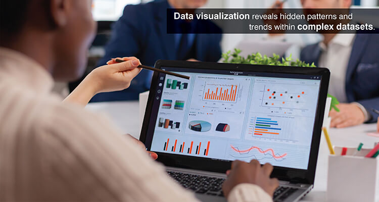
Data visualization enables business leaders to convert and visualize the information contained within their data so they can make informed decisions. This allows users to interact with dashboards to view and review data from different angles to derive data driven intelligence.
Table of Contents
Organizations are producing vast amounts of data daily but in its raw form. Raw data does not show the actual insight the data contains. Business analysts thus find it difficult to determine what trends or anomalies exist within their large data sets.
Data visualization provides a solution by displaying abstract numbers in a visual format that highlights trend and anomalies in an easily digestible manner.
Research shows that data can be processed by our brain visually 60,000 times faster than it could be processed via text. Therefore, a professional is able to analyze and understand complex data in a much shorter amount of time.
The use of charts and graphs and interactive dashboards provide the ability for a team to quickly identify potential areas for improvement. So, the strategic use of visual analytics helps improve decision making and create better alignment among teams.
This is so important that data shows 80% of all business decisions were already relying on data visualizations by 2025. This means data visualization is a reliable method of gathering data driven insights.
What is Data Visualization
Data visualization is the graphical expression of information using various representations such as graphs, charts and maps. The goal is to transform your data sets into visual representations of the data so that you can easily interpret and understand large amounts of information.
Data visualization uses the human ability to visually perceive patterns and objects. Since 90 percent of the information that is sent from your eyes to your brain is visual, visualization can take advantage of the way humans process information.
Here the two main goals are to provide a simpler method of interpreting complex data sets to allow users to gain insights and to improve understanding of insights to both technical and nontechnical stakeholders.
Visual storytelling with data is one of the fundamental skills of working within Big Data analytics systems by providing a link between data collection, data processing and actionable intelligence.
Challenges Without Proper Data Visualization

The importance of data visualization to an organization becomes clear when evaluating the obstacles faced without a data visualization tool:
- Substantial difficulty in analyzing large amounts of raw data manually to identify valuable insight.
- Trends, patterns and anomalies can be difficult to detect when viewed in tabular format.
- Miscommunication among departments and teams leads to misaligned objectives and duplicate effort.
- The amount of mental processing required to review and analyze large amounts of numerical data increases the professional’s cognitive load, slowing down their ability to make decisions.
- Lack of a mechanism to verify the accuracy of the data through visual means increases the chances of errors being made during the interpretation of the data.
- Data remains siloed as a result of employees having to rely on technical expertise to view and analyze the data.
Build custom dashboards that turn complex data into clear insights.
Build custom dashboardsImportance of Data Visualization in Understanding Data
Effective representation of complex datasets is central to understanding those datasets. Data visualization, however, extends beyond aesthetics to enhance cognition and accelerate analysis.
Identifying patterns, trends and outliers
As analysts create scatter plots of variables or line charts that show how one metric tracks over time, relationships are immediately visible. Visual displays also make clustering behavior and directional movement visible, along with a variety of distribution characteristics.
Seasonal sales patterns emerge in temporal visualizations, for example, showing peak selling times. Segmentation of customers based on their behavior emerges using multidimensional plots.
Accelerating insight and decision making
An MIT research has found that we can recognize images in as little as 13 milliseconds and this is why when executives look at dashboard and data reporting visualizations instead of tabled reports, they understand the company’s condition in just a few seconds.
Inventory levels viewed through visual alerts allow supply chain managers to react to stockouts before there is an issue affecting customers. Financial analysts viewing market activity through real-time charts and graphs can act or sell at the most advantageous time.
The efficiency gains are also seen in the boardroom, where the use of visual analytics was reported to reduce the length of business meetings by up to 24%.
Interactive exploration and user engagement
Static visualizations offer a view of an issue from a singular perspective, whereas interactive visualizations enable users to adjust the display for their own exploration and evaluation of analytical dimensions.
Business analysts who are analyzing sales may choose to limit their analysis based on region, product or time period. Drill down capability also allows them to perform root cause analysis without needing to submit a request for a separate report.
Interactive dashboards allow managers to utilize visual discovery tools that help them find the information they need in a timely manner at a 28% more success rate than those without access.
Minimizing errors and improving data quality
The quality of data is quickly determined by how well it fits the visualization model. If a scatter plot shows impossible values for each other or if there are time series with holes they indicate that an error occurred.
The problem arises when a designer does not provide enough context for the visualization, because studies have shown that in such cases 84% of users will misinterpret the data presented in the visualization.
Incomplete time series become apparent from missing data in the visualizations. Box plots and distribution charts clearly show outliers in the data. By providing this type of feedback loop, the visualization provides useful insight into the analysis and supports the accuracy of the data.
Data Visualization Types and Their Applications
Data visualization has many different formats which provide analysts with a variety of options depending upon what you want to analyze.
Basic chart types in data visualization
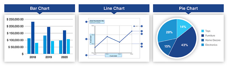
Bar charts: Compares discrete categories like sales by product line, customer counts by region. The primary function of bar charts is to compare magnitudes using length to encode data.
Line charts: Temporal analysis through the connection of data points over time, summarizing trends and fluctuations and direction of movement. These are used to view the trajectories of revenues and website traffic trends.
Pie charts: Proportional relationships can be represented using pie charts, which are effective when representing a composition of parts where the number of parts is limited, such as market share distribution among competitors or budget allocations among departments.
Each format should be selected based on the characteristics of the data and the analytical goals being pursued. Bar charts are best suited for comparative analysis of categories, line charts require sequential data and pie charts are suited for the display of part to whole relationships.
Get expert guidance to turn complex data into visual clarity.
Talk to a consultantAdvanced and multivariate visualizations
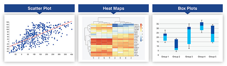
Scatter plots: These allow for an investigation of associations between two continuous variables that can identify relationship trends, cluster behaviors in data etc. For example, a company uses a scatter plot to analyze how the age of their customers relates to the amount they purchase.
Heat maps: Used to compress large amounts of data into color coded matrices, with the intensity of the color representing the magnitude of the variable being examined. A correlation matrix is used to evaluate the associations among many variables at one time.
Box plots: These are a way of summarizing the distribution of values within a dataset by showing the median and quartiles of the distribution. A financial analyst may use them to evaluate the returns associated with different investments.
Specialized visual forms
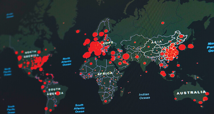
Maps: A form of visualizing geographic data as spatial representation and they show the data that can be associated with those locations. Retail businesses use maps to visually analyze how each of their stores is performing through spatial and image analytics.
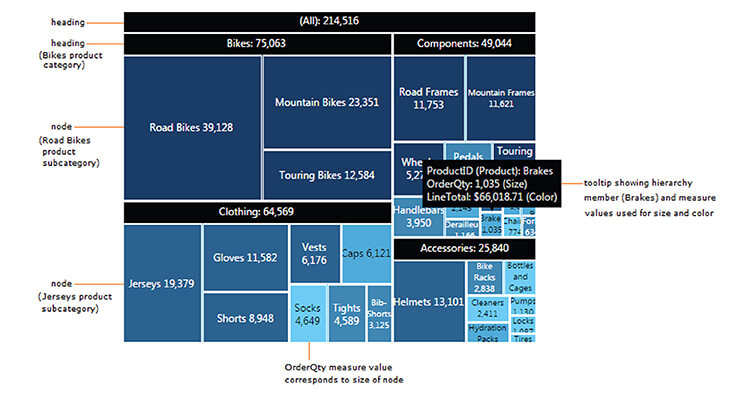
Tree maps: These are used to visually communicate the relationship between different levels of hierarchy through nested rectangles that are scaled according to their quantitative value. Companies can use tree maps to create visual displays of budgets and categories of products.
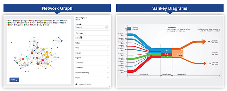
Network graphs: They provide relationships between various entities through the use of nodes and edges that show the types of connections that exist. Social media networks can be analyzed using network graphs to understand the structure of communities.
Sankey diagrams: These diagrams graphically illustrate the volume or quantity of flow from one stage to another through the use of proportionate bands to represent the volume of flow. Marketers use them to illustrate the stages of a customer’s journey.
Interactive features such as filtering and hovering allow users to dynamically explore and iteratively investigate these specialized visualizations.
Interactive dashboard and reporting
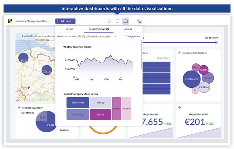
More than one visualization can create a platform of intelligent understanding that provides the complete picture. Dashboard design is centered on three main principles: organization logically, visual hierarchy and the creation of a narrative path for users to follow as they are guided through their analytical journey.
Dashboards become real-time operational centers as organizations use them to monitor the current state of the systems and all exceptions that need to be addressed immediately.
Modern platforms now provide visual analytics capabilities, allowing users to explore data in a flexible manner. They can select date ranges, apply filters and rearrange views as needed to answer spontaneous questions.
Measuring The Data Visualization Benefits
Organizations can measure the benefits from data visualizations so they can justify spending money and determine how they should improve continually. Studies show that 77% of all organizations utilizing visualization tools have reported a substantial increase in their decision making efficiency.
The following are examples of successful measurements of data visualization:
| Metric category | Key indicators | Measurement approach |
|---|---|---|
| User engagement | Dashboard access frequency, session durations, feature utilization rates | Analytics tracking and usage monitoring |
| Decision speed | Time to insight, approval cycle duration, response times | Pre/post implementation comparison |
| Error reduction | Interpretation mistakes, analytical rework requirements | Incident tracking and quality audits |
Decision making speed improvements help evaluate the operational impact that occurs due to differences in cycle time between pre-deployment and post-deployment. This improvement is measured by tracking how fast teams can make decisions or react to changes in the marketplace.
Visual quality assurance mechanisms resulting in reductions in error rates demonstrates increased accuracy. Teams can track the number of errors they make in interpreting the data and the number of incorrect strategic choices they make.
Improved performance can be demonstrated in many ways, including an increase in revenue through improved opportunities identified, cost savings through improved operational efficiency and risk management.
Continuous improvement of visualizations:
- Usage analytics provide insight into how users interact with the visualizations like click patterns, filter applications and exploration paths.
- User feedback provides insight into which visualizations are generating the most value and which design elements are causing confusion.
- Regular reviews of usage data and business outcomes allow continuously improving upon the visualizations, viewing them as living systems.
Real Time Lead Scoring Model for a U.S. Tech Company

A US based, integrated technology services firm experienced challenges due to the unstructured nature of the leads generated through various channels. This made it extremely challenging for the sales team to properly evaluate potential customer leads.
Hitech Analytics developed a predictive lead scoring model for this client by first cleaning their data and then developing an analytical view of the data’s key characteristics. Interactive data visualization dashboards were developed that visually presented both lead scores and trends to allow sales teams to rapidly identify, prioritize and act upon high-quality opportunities.
The end results were:
- Sales reps’ productivity increased by 50%.
- MQL to SQL conversion improved 200%.
- 95% of sorted emails matched keyword models.
Comparing The Top Data Visualization Tools
When selecting a suitable platform for your organization, you need to know what some of the leading solutions are doing to satisfy different organizational needs. Following tables compares the most popular tools used today:
| Tool | Tool | Best for | Learning curve |
|---|---|---|---|
| Tableau | Advanced analytics, extensive chart library, strong community, enterprise scalability | Technical analysts and business users requiring sophisticated visualizations | Moderate |
| Microsoft Power BI | Microsoft integration, AI-powered features, affordable pricing, comprehensive connectors | Organizations within Microsoft ecosystem seeking cost effective solutions | Gentle |
| Qlik Sense | Associative engine, free form exploration, strong data integration | Power users requiring deep exploratory analytics | Moderate |
| Looker | Cloud based, strong data modeling, Google Cloud integration | Technical users comfortable with SQL and data modeling | Steep |
| Zoho Analytics | Cost effective, AI driven insights, user friendly, extensive integrations | Small to medium businesses requiring accessible self-service analytics | Easy |
| Plotly | Highly customizable, programmatic control, developer centric in Python/R/JavaScript | Developers building custom applications requiring visualization flexibility | Requires coding |
Selection of tool is based on organization context, such as technical capability and level of integration. Enterprise organizations will be more likely to select solutions that align with their existing technology stack. Development teams will be more concerned with programmatic control.
Conclusion
Data visualization provides the critical bridge between raw data and actionable intelligence that enables organizations to achieve success. This enables professionals to identify patterns, accelerate decisions and communicate insights effectively. Data visualization best practices emphasize matching visual formats to analytical needs and designing for user engagement.
Trends point to future growth toward AI integration to automate insight discovery, immersive visualizations utilizing augmented reality and adaptive systems to personalize displays. As data volumes grow, the ability to visualize becomes an increasingly important competitive advantage through data driven intelligence.
Improve reporting quality with professional visualization advice.
Improve reporting
At Hitech Analytics, we understand that each company has different needs, business goals and technology environments. With advanced analytics, you can make right decisions, prepare for the future and leverage intelligence from huge data volumes. We embed analytical intelligence into your everyday data and turn it into actionable insights.