
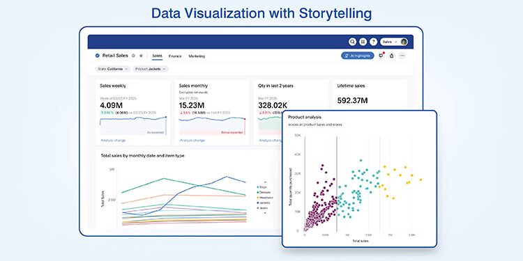
Data visualization makes data easily understandable for decision makers by simplified layouts and visual communication. Storytelling with charts and graphs and dashboards help businesses identify trends, connect people and take action on strategies across all business areas.
Table of Contents
Companies work with an enormous amount of information today but often have difficulty extracting usable knowledge from it. Raw spreadsheets and database searches provide decision makers with an overwhelming amount of data rather than clarity.
Data visualization transforms abstract raw numbers into a visual format for immediate processing by the brain. The truth of this has been supported by research that states the human brain is able to visually process information 60,000 times faster than traditional written information.
Charts and graphs allow complex sets of data to be understood and viewed without needing specialized technical skills. Effective use of visual storytelling with data enables faster decisions, better team alignment and increased confidence in making conclusions.
Studies show that as a result of proper data visualization companies can see a 25% improvement in decision making efficiency. Properly done visualization provides context to the data allowing it to connect with its audience.
What is data storytelling with data visualization?
Data storytelling is the use of both narrative techniques and visual to clearly communicate your analysis and findings to others.
Definition & core elements
Data-driven storytelling techniques are built upon three key components: the accuracy of the data, the narrative structure and the visual representation. The visual presentation communicates the data while the story communicates why the data is important and how it should affect the action of stakeholders.
Why visualization is central to storytelling
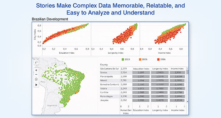
Visuals have an advantage over text in terms of being able to be interpreted by the human brain. Since 90% of the information we receive is through visual means, the trend of presenting data visually is a necessary biological process for today’s analyst.
The importance of data storytelling in business is that it also provides greater depth of comprehension. Data visualization engages many cognitive processes at once, therefore, it provides a stronger understanding of the data; compared to simply reading about the data.
Get custom dashboards that simplify insights and drive action
Request custom dashboardsBenefits of turning data into stories
Data turned into a visual narrative generates quantifiable improvement in each of the operational areas listed below. The organizations that have implemented the benefits of data visualization in decision-making have experienced the following:
- Faster decision making: Stakeholders quickly understand the situation and come to an agreement without extended deliberations.
- Stakeholder alignment: The use of a common reference point (the story) eliminates conflicting views of data.
- Better retention and recall: Long term retention of visually presented information is significantly higher than text based reports.
- Higher levels of confidence in data: As stakeholders can review the evidence presented to support the recommendation being made.
Five real world examples of turning data into stories
Real-world examples of data storytelling show how information is presented as narratives by different organizations and how that helps them in better understanding and decision making.
1. Sales performance trends visualized for strategy
A large retail electronics store was tracking sales by category and location. Each month the company received a report indicating that sales increased from $2.8 million to $3.1 million which initially seemed like good news.
Once the sales director used line charts to compare each category’s sales performance over time, a new picture began to emerge. Smart home device sales were consistently increasing, while home audio equipment sales were decreasing. These were similar to market trends in 2024 where premium categories had double digit growth in spite of declining entry level categories.
Stacked area charts indicated that phones and wearable accounted for approximately eighty percent of the growth.
Types of visualizations used that revealed insights for better strategy are as follows:
| Visualization Type | Primary Use | Strategic Insight Revealed |
|---|---|---|
| Line charts | Temporal trends | Category-specific trajectory changes |
| Stacked area charts | Product mix evolution | Two categories driving eighty percent of growth |
| Heat maps | Regional performance | Urban locations exceeding suburban by specific margins |
| Combo charts | Revenue vs. profitability | High-growth products showing margin compression |
The visualization provided a clear indication that while the company’s overall sales had increased, there were declining categories that needed attention.
As a result, the company decided to allocate more floor space to smart home displays instead of the declining audio equipment and renegotiated purchasing agreements to increase the profit margin of the growing categories.
2. Customer behavior explained through visual insights
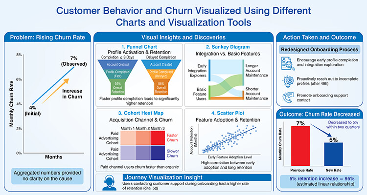
A subscription based software business observed its month to month churn rate increase from four percent to seven percent. However, they could not find out what was causing it from looking at all their aggregated numbers.
The product development team created funnel charts which tracked user activity as they went through each step of activating their accounts.
Through these visual representations, the development team discovered that when users completed their account profile in less than or equal to three days after creating their account, their overall account retention was ninety two percent compared with fifty eight percent for users who delayed completing their account profile.
Sankey diagrams illustrated that users that began to explore the integration features early were maintaining their accounts longer than users who used basic features of the software.
Through turning complex data into visuals, the product development team uncovered several key trends:
- Cohort heat maps showed that users acquired from paid advertising channels churned faster than organic referral users.
- Scatter plots clearly demonstrated a very high correlation between adopting software features early and how long the users retained their accounts.
- The journey visualization indicated that users contacted customer support while they were in the process of onboarding actually had a higher rate of retention.
The company redesigned its onboarding process to encourage users to complete their profile and explore integration features of the product early in their experience. Also, they proactively reached out to users for completing their onboarding process in 48 hours.
As a result, the companies churn rate decreased to five percent within two quarters. If we assume a linear relationship, survey shows that a 5% increase in retention is equivalent to a profit increase of approximately 95%.
3. Marketing performance communicated with comparative visuals
The initial campaign results of a consumer goods company’s five channel campaign found that email was the best performing campaign, which led to recommendations to increase the email budget.
However, when the multi touch attribution (MTA) data was visualized using stacked bar charts, a different story emerged. The stacked bar charts indicated that although email had the most click through activity, social media and content marketing accounted for 90% of all converting customer journeys through the company.
Waterfall charts illustrated that content marketing produced an additional influence on each conversion that was 33% less than that of paid search.
Some key marketing related visualization insights were:
- Social media increased branded search activity by 30% from Q1-Q2
- E-mail campaigns generated a 12% conversion rate for engaged segments, whereas campaigns sent to unengaged segments generated a 2% conversion rate
- Published content, 8 weeks previous, was shown to correlate with current conversion increases
- Display advertising had a minimal impact as a standalone channel, but did demonstrate an ability to amplify the effectiveness of other channels
Timeline based visualizations also indicated that campaigns that utilized coordinated messaging across multiple channels performed better than those that used individual messaging techniques. As such, the company redirected budget into content development and away from paid search.
Also they developed dashboards that measured channel contributions beyond last click attributions, indicating that the awareness channels should continue to receive funding even though their direct conversion rates were lower.
4. Operational efficiency revealed through performance dashboards
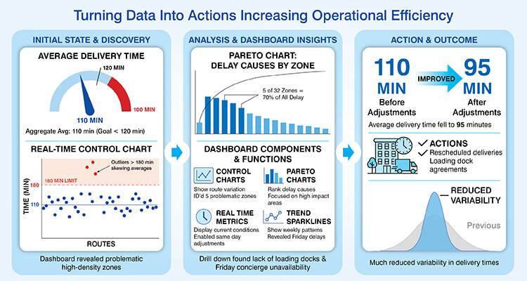
A logistics company delivered packages and aimed to complete deliveries in two hours or less. Aggregate data reported an average delivery time of 110 minutes which was below their goal.
Leadership developed a real time dashboard system using control charts to show each route’s on time status. The dashboard displayed how well most routes were doing but it also displayed that certain areas were taking longer than 180 minutes thus skewing averages.
Pareto charts indicated that five of thirty two zones were responsible for seventy percent of all delay.
Operational dashboard components & functions that were used revealed the following:
| Component | Function | Operational benefit |
|---|---|---|
| Control charts | Show route-level variation | Identified five problematic zones |
| Pareto charts | Rank delay causes | Focused efforts on high-impact areas |
| Real-time metrics | Display current conditions | Enabled same-day route adjustments |
| Trend sparklines | Show weekly patterns | Revealed Friday delays exceeding other days |
Drill down visuals demonstrated that all zones experiencing similar problems had common attributes being located in high density apartment complexes lacking loading docks. Root cause analysis concluded that delivery delays due to Fridays were caused by concierges in these high density apartment complexes not being available.
The company rescheduled deliveries to the affected zones at optimal times and worked out loading dock access agreements with the building managers. After making these adjustments, the company’s average delivery time fell to ninety five minutes with much reduced variability.
Turn operational data into insights your teams can act on
Get in touch with us5. Executive metrics presented as decision ready visual stories
A manufacturing firm’s CEO was receiving monthly, forty page spreadsheet reports covering the firms’ financials, operations and competitive position.
The quantity of information prevented a rapid, strategic analysis.
The strategy team created executive dashboard systems utilizing visual hierarchy. The top level display utilized five key metrics including revenue growth, operating margin, production efficiency, market share and innovation pipeline, each with color coded status indicators and comparison to target levels.
Clicking into production efficiency drilldowns would show that two of seven facilities operated below benchmark levels. Clicking into innovation pipeline visualization would show product launches consistently missed scheduled dates by three months average.
These multi layered visualizations allowed the CEO to identify strategic priorities in minutes vs. hours. The quarterly strategic reviews went from full day sessions to focused two hour meetings centered around visual dashboards.
Vendor Performance Data Visualization for a Global Manufacturer

A U.S. based manufacturer that serves the fundraising and non profit sectors had vendor data stored in a siloed format, they lacked real time access to their data and performing a bi-annual margin analysis was expensive.
Hitech Analytics developed a consolidated data and dashboard solution to track vendor performance, costs, margins and production KPIs for multiple regions. This enabled the manufacturer to have real time reporting capabilities, receive alerts when there were significant changes to margins and have easy access to the data so that it could be shared among stakeholders.
The end results were:
- Vendor performance and cost drivers were visible 100% in real time
- 80% reduction in time spent on analyzing margins
- Faster profitability analysis across customers and products (from 6 months to 1 week)
Best practices for effective data visualization storytelling
A structured approach to implementing best practices for effective data visualization are developed systematically prior to constructing the visualization.
The most important practices in data visualization include:
- Develop your story first and then develop your visualization. Focus on answering decision questions.
- Match the correct chart to illustrate the relationship you want to show. Temporal trend analysis is often best represented using a line chart, part to whole relationships are best shown using a pie chart.
- Keep your displays simple and do not confuse your viewers by overwhelming them with too many insights.
- Provide enough context so that your viewers can interpret your results appropriately. Establish a baseline, benchmark or target as needed to help assess your findings.
- Tailor the amount of detail and complexity in your visualization to match your intended audience.
Common mistakes to avoid in data visualization storytelling
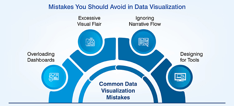
Predictable mistakes that organizations make to impede data insights visualization effectiveness can be easily avoided to create clarity. Common mistakes to avoid in data visualization are as follows:
- Overloading dashboards: The presentation of multiple of charts at once overwhelms the ability to process this amount of information and therefore causes viewers to ignore most of the information.
- Using too much flair on your visuals: Using three dimensional charts and excessive animation needlessly does little to help the viewer understand what is being represented in the data.
- Ignoring flow of the narrative: When you do not have related sequence of charts in a series of stories, it creates confusion among the audience, who might then form their own interpretation of the data.
- Designing for tools instead of users: By accepting the defaults of software packages and not taking into consideration the needs of the people viewing the visualizations organizations produce poor data visualization.
Conclusion
Data visualization provides a framework for turning an organization’s available information into interactive data dashboards representing useful knowledge on which decisions are based. Benefits of data visualization enable how quickly an individual can comprehend information, align with other stakeholders and make decisions with confidence.
Ultimately, long term competitive advantage will be experienced by those organizations that are best able to design effective data communication strategies to transform complex data sets into clear, understandable visual stories. This need will continue to grow stronger as the volume of available data continues to expand.
Stay updated with live dashboards that reflect current performance
Contact us
At Hitech Analytics, we understand that each company has different needs, business goals and technology environments. With advanced analytics, you can make right decisions, prepare for the future and leverage intelligence from huge data volumes. We embed analytical intelligence into your everyday data and turn it into actionable insights.