BI dashboards have become the numero uno tool for making fast business decisions today as they convert raw data into real-time visual insights. So, it has become imperative for business leaders to know how business intelligence dashboards work, their features, about the popular BI platforms, their building processes and about mistakes in their implementation.
Table of Contents
We have entered an age where we are leaving even traditional digital adoption behind and integrating AI into everything. Information is coming in fast, and we need to understand them fast, without waiting for data analysts to explain things.
It is at this point of comprehension that Business Intelligence (BI) dashboards help us get a hold of the situation. They pull data from disparate sources and display results on a unified visual interface, making the relations between data and metrics easy to understand.
The BI dashboard market had already hit $22.8 billion in 2021 and was projected to cross $32.856 billion by 2026. That’s a measure of the speed with which companies are adopting BI tools and abandoning spreadsheets and pure gut feelings.
So for businesses, avoiding BI dashboards has become a risk, and so whether you need to build or buy, you need a practical understanding of BI tools. Here we’ve broken down the topic into what actually matters when you’re going for BI dashboards.
What is a BI dashboard and how does it work?
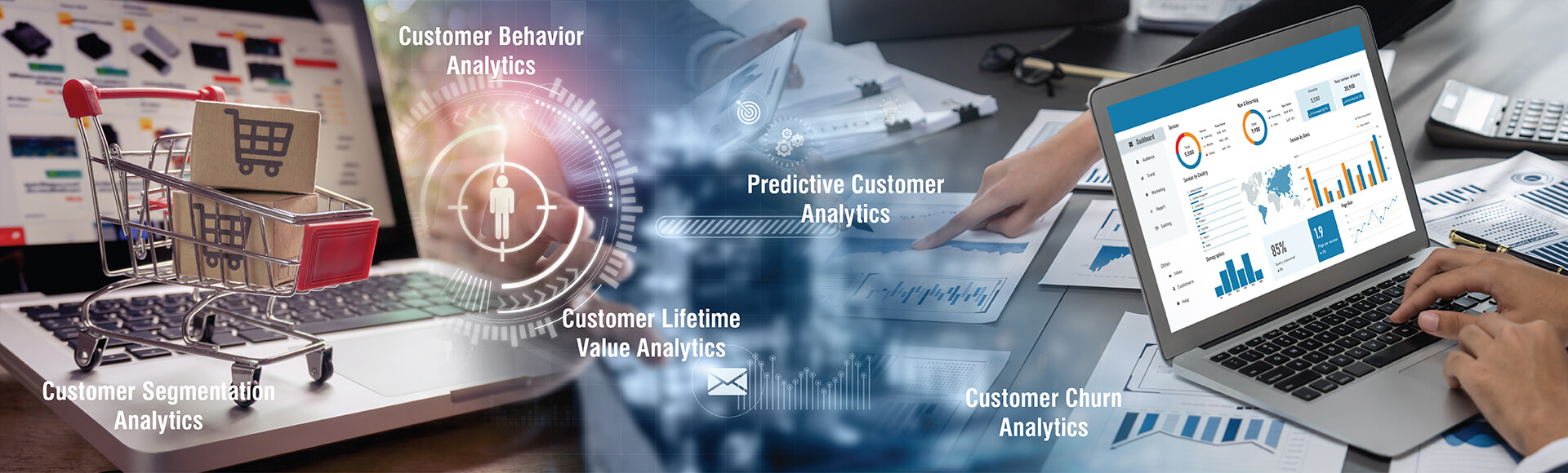
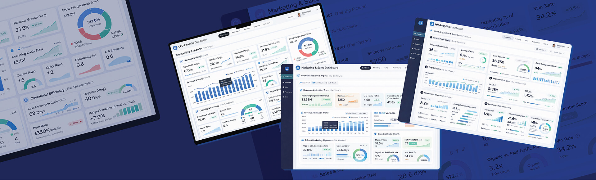
Business Intelligence (BI) Dashboards are widely popular and used as they consolidate data from multiple sources to provide a visual interface that presents real-time Key Performance Indicators (KPIs), trends, and visual metrics. It empowers you to understand and manage business data just like a smartwatch displays health metrics on a single screen. But here the sole focus is on operational, financial, and strategic business data.
BI dashboards pull data from databases, CRMs, ERPs, spreadsheets, APIs, and cloud platforms. The data is then transformed into charts, graphs, gauges, and tables that leave a significant impact. Even decision-makers without hands on expertise of data science can quickly identify trends, risks, and opportunities. And all these with no or minimal dependency on complex spreadsheets or IT-generated reports.
These dashboards update in near real-time, and not like static reports that showcase past performance. With role-based views, executives and managers now have production speeds, sales pipelines, or financial burn rates continuously at their fingertips. They can use insights from the same underlying data, ensuring timely, informed decisions.
Find out How a BI Dashboard Fits Your Data Stack
Talk to our BI expertsWhat are the benefits of using a BI dashboard for businesses?
Studies by the KPI Institute show that 68% of organizations found measurable performance improvements after adopting dashboard systems. In practice it boils down to:
Time savings
When your BI team builds a properly automated Data Analytics Dashboard, they stop spending hours updating reports manually. As end users get quick and reliable answers without waiting on IT or data teams, time savings spreads through operations. A Forrester study for Power BI found companies getting 366% ROI over 3 years, basically just from the time saved and decisions made with the aid of BI dashboards.
Early problem detection
Each type of dashboard has a role to play. Manufacturing dashboards track production speeds and trigger alerts when lines slow down. On the other hand sales dashboards flag when any pipeline coverage drops below safe thresholds. And finance dashboards throw warnings when burn rate exceeds projections. This helps businesses catch issues before they become unmanageable.
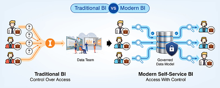
Connecting data from silos
Business data has to be in silos because of operational and security reasons. Customer information is found in CRMs, financial data in ERPs, website metrics in Google Analytics dashboard and the operational data is found scattered across departmental tools. BI tools integrate these sources so you can get the complete picture by connecting related sources. You can connect sales performance to marketing spend to customer satisfaction scores with a few clicks and understand the metrics.
Improved planning with BI tools
Interactive Dashboards can forecast product demand, identify seasonal trends and predict cash flow by analyzing historical data and trends. There’s no guesswork here and every bit of information is based on actual performance.
Decision speed increase
Humans are visual, and for executives and managers it’s way easer to digest the information laid out on a dashboard rather than raising requests for reports and keep waiting while opportunities go by. With dashboards they get answers to their questions immediately, and if needed can ask for analysis confirmation from experts. But dashboards increase the ability to make strategic pivots faster. And so you can catch opportunities before the rest of the market starts to move.
The difference between dashboards and traditional reporting? Reports tell you what happened last month. Dashboards tell you what’s happening now and what it means for tomorrow.
Want to Quantify the ROI of BI Dashboards for Your Business”
Get a quick assessmentWhat are the essential features of a good BI dashboard?
After you sort the wheat from the chaff there are certain BI Dashboard features that you find are nonnegotiable.
Smooth multisource data integration
Your BI dashboard must be able to pull data from disparate sources like data warehouses, data lakes, operational systems, cloud services and external feeds or APIs. It must be capable of handling structured, semi-structured and unstructured data without requiring complex ETL processes for each and every connection.
Realtime or near real-time updates
You might as well be relying on guesswork if you were to work on stale or outdated data. You can’t respond to current problems if your manufacturing dashboard shows production rates from 2 hours ago. If your sales dashboard updates daily and not by the hour, minute or second, you’ll always be a day behind competitors. So real time or near real-time updates are a must, and most modern platforms offer scheduled refreshes from hourly to real-time streaming.
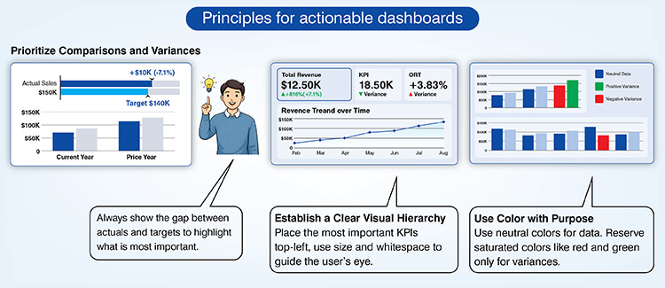
Visualization options must match data types
Go simple. For comparisons, use bar charts, line graphs for trends, heat maps for density, scatter plots for correlations; gauges for single metrics and use tables for detailed breakdowns. BI Dashboard Design that prizes fancy visualizations can end up lacking clarity. Actually a 2020 survey by Accenture and Qlik proved this. The study found 74% of employees felt overwhelmed when working with dashboards that try to impress more than inform.
Role based customization
This is a must because different needs require different views. That’s the true strength of BI dashboards. While executives need a view of strategic KPIs, department heads need to see and understand tactical metrics for their domain. At the same time individual contributors need operational details for their specific tasks. 1 dashboard template doesn’t serve all these audiences. So a good BI dashboard must provide drag and drop customization without requiring coding skills.
Drill-down capabilities
Users need to probe the details when they spot any issue or opportunity. High level views are the first thing you look at but sometimes you need to understand why a particular metric moved. You need to be able to drill down and do root cause analysis. Clicking on a revenue figure should show up product breakdowns, regional performance or customer segments as needed. Without this ability to probe dashboards can’t become active analysis tools.
Mobile responsiveness
Managers are always on the move and more at meetings than at their desks. They need to access the dashboard from their phones and tablets, with interfaces designed for touch screens and small displays. Mobile optimized dashboards maintain their functionality without forcing users to zoom and scroll.
Automated alerts
You can’t police your data and dashboard all day. And so, you can set automated alarms to go off if metrics and values cross target thresholds. For instance, you get an alert as soon as customer churn exceeds acceptable levels or inventory drops below reorder points. This proactive monitoring is one of the most prized features of BI tools and dashboards.
Security controls
Business means you have trade secrets, confidential information and information whose visibility and access must be role based. So different access levels are needed for different users. Setting row-level security makes sure that sales managers can see only the data of their respective regions. Setting filters for department level data prevents cross-functional data leaks. And authentication mechanisms can verify user identity before displaying dashboards.
Want to Audit Your Existing BI Dashboards for Gaps
Contact us TodayWhat are some popular BI dashboard tools?
Microsoft Power BI, Tableau and Qlik are leaders but other tools are catching up or serving to niches.
| Platform | Best For | Key Strengths | Considerations |
|---|---|---|---|
| Microsoft Power BI | Microsoft ecosystem enterprises |
|
Requires Windows; limited outside Microsoft stack |
| Tableau | Complex analytics & large datasets |
|
Steeper learning curve; higher cost |
| Qlik | Complex data relationships |
|
Complex pricing; requires training |
| Looker | Embedded analytics |
|
Requires SQL knowledge; Google Cloud integration |
| Domo | Distributed teams |
|
Can be expensive; feature overload for simple needs |
| Zoho Analytics | Small businesses |
|
Limited enterprise features; basic visualizations |
| Geckoboard / Databox / Klipfolio | Dashboard focused needs |
|
Not full BI suites; limited advanced analytics |
Want help in selecting the Right BI Tool
Speak to our BI consultant – NowTool selection depends on your data infrastructure, user technical skills, budget constraints and specific use cases. A company that primarily uses Microsoft products may not choose Tableau. Or a data science team doing advanced analytics may bypass Zoho for tools more geared to their use case.
How do you create an effective BI dashboard?
It’s natural to ask how to build a BI Dashboard because it needs systematic planning to handle flexibility needs and customizability. We can break the process down into 7 overarching steps.
| Phase | Key Actions | Critical Success Factors |
|---|---|---|
| 1. Define Requirements |
|
Learn from actual users. A dashboard for tracking company health has considerations that will differ widely from a logistics dashboard for monitoring shipment status |
| 2. Select KPIs |
|
Not every metric deserves space. Measure only those factors that help drive decisions, so there is less visual clutter |
| 3. Validate Data Sources |
|
Visualization may be excellent, but bad data will still give bad insights |
| 4. Choose Platform |
|
Before committing, test the platforms with your largest expected datasets. You must test security features against the most sensitive data scenarios. |
| 5. Design Interface |
|
Simplicity beats sophistication. Try to reduce the need to scroll, because it’s a signal you’ve included too much. Cut ruthlessly. |
| 6. Iterate & Refine |
|
Most initial dashboards miss important metrics or include unnecessary ones. Treat the first version as a draft and not as the finished product. |
| 7. Establish Governance |
|
Without ongoing stewardship dashboards become obsolete. You have to schedule quarterly reviews for adding relevant metrics and deprecating unused ones. |
3 Critical BI Dashboard Implementation Mistakes You Must Avoid
Let’s Understand the common yet dangerous BI dashboard implementation mistakes that limit usability, slow decision-making, create data silos, and prevent organizations from realizing true intelligence.
Skipping stakeholder consultation
Not consulting stakeholders on every step will lead to missing relevance. Dashboards built in isolation rarely produce a tool that users readily adopt. You need to rope in end users from day 1 and take their views to define the build.
Too many metrics
More data doesn’t mean better insights. Every additional metric increases the cognitive load on users. Most effective dashboards track a maximum of 5-10 core KPIs in a single view, not 50. If you need to explain why a metric matters, then better remove it.
Neglecting data quality
This is the foundation. Building the best dashboard is useless if the data has missing values, duplicates, misspellings, inconsistent categorizations and other errors. You lose user trust when data problems are obvious, and so you need to build pipelines to fix data quality before attempting visualizations.
Conclusion
BI dashboards convert how organizations process and act on information. Studies show that companies using well-designed dashboards make faster decisions, catch problems earlier and can cash in on opportunities before competitors. They stop flying blind.
The key word is “well designed.” Flashy ineffective dashboards waste money while good ones become indispensable tools for teams. It’s careful planning, user-focused design, quality data and continuous improvement that spell the difference.
You can’t build custom dashboards without understanding actual user needs. If you’re just planning on using BI tools prioritize platforms that integrate with your existing systems. If you’re trying to improve existing dashboards, talk to us, we’ll tell you what’s actually missing.
The technology itself is solved. The challenge is implementation. And we take care of that.
It’s time to Build or Fix Your BI Dashboards with Experts
Contact our BI specialists
At Hitech Analytics, we understand that each company has different needs, business goals and technology environments. With advanced analytics, you can make right decisions, prepare for the future and leverage intelligence from huge data volumes. We embed analytical intelligence into your everyday data and turn it into actionable insights.